


“City Vibe” is a music bar that famous for its cozy retro atmosphere, signature cocktails and musical parties. Bar guests are usually wealthy people, whose youth was spent in 1980s and 90s. However, young people also love this bar for its unique vibe. That’s why the design for such a place should reflect the spirit of the past, but at the same time be modern and attractive to all visitors.
For the logo, I chose a retro-style font (“Olivetti Neue”) and gave it an abstract shape that looks a bit like an equalizer. Thus, the logo communicates that this is not just a bar, but a place where you can always listen to good music.
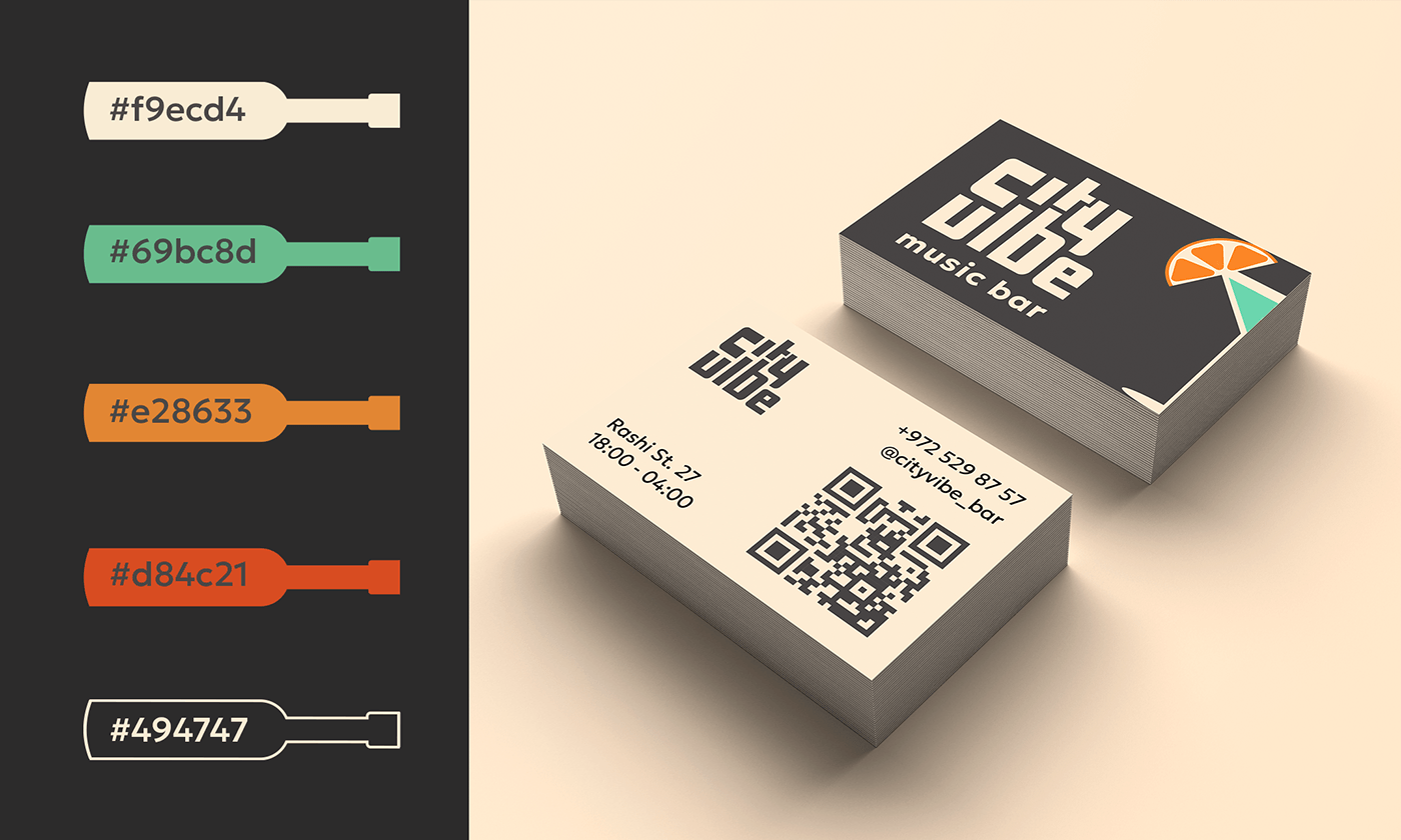
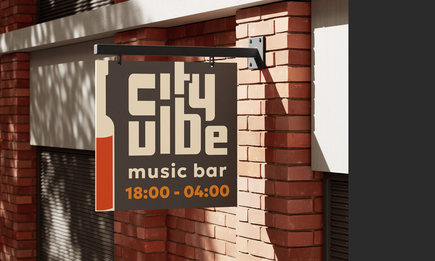
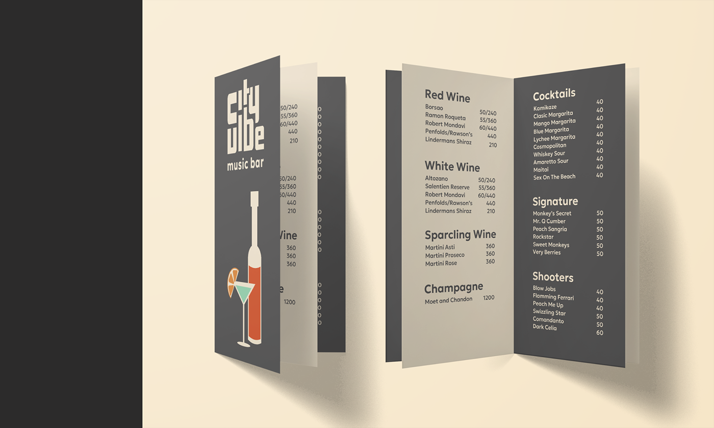
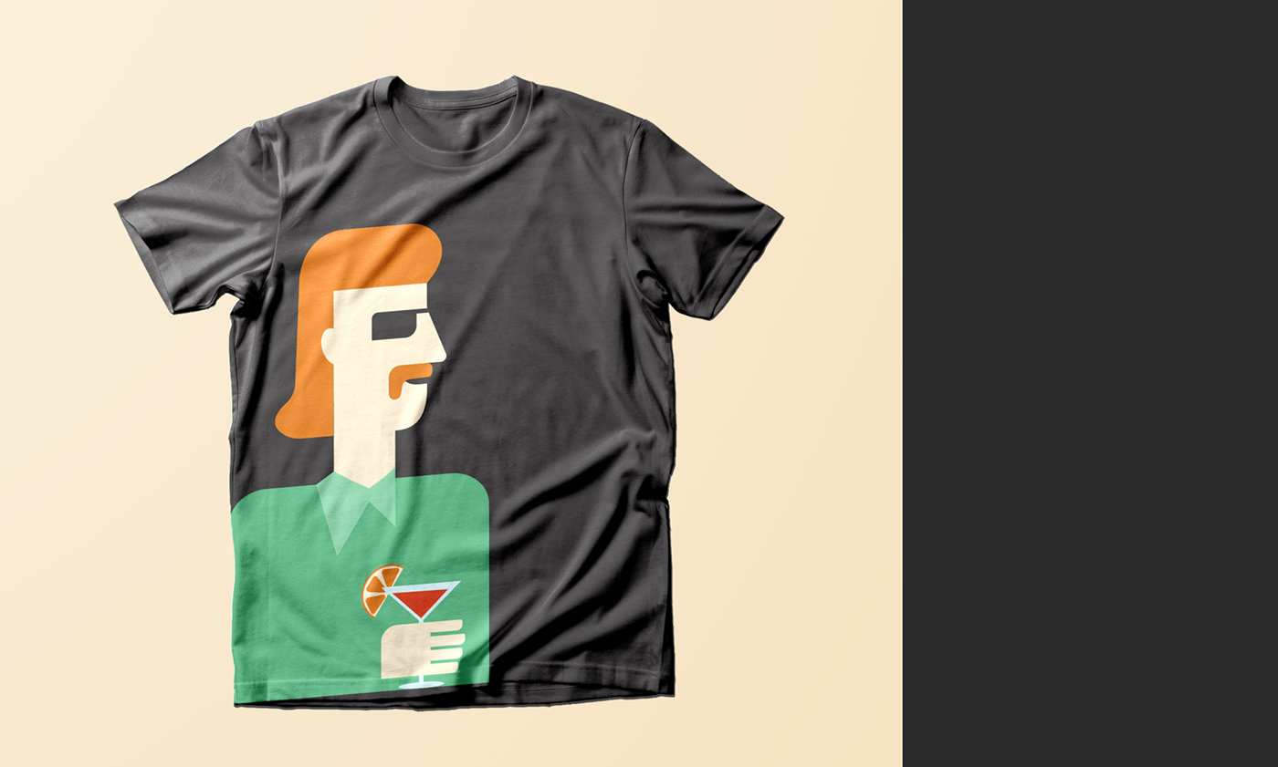
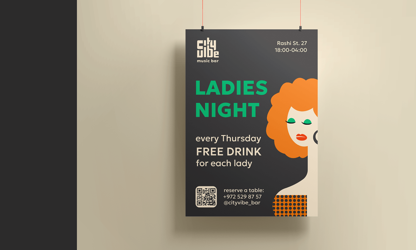
For the identity, I created simple illustrations in a retro style. I used a small color palette so as not to overweight the design. I suggested a dark background and a sans serif font (“Geologica”) for the typesetting to make the identity more modern.
For the logo, I chose a retro-style font (“Olivetti Neue”) and gave it an abstract shape that looks a bit like an equalizer. Thus, the logo communicates that this is not just a bar, but a place where you can always listen to good music.
For the identity, I created simple illustrations in a retro style. I used a small color palette so as not to overweight the design. I suggested a dark background and a sans serif font (“Geologica”) for the typesetting to make the identity more modern.
Thank you for watching!
Contact me with telegram: @tanyaklochkova1


